Wednesday, 7 October 2015

Analogue Communique. Thinking and Practice.

Analogue communique is all about creating hand rendered typography to communicate a message. Using characters within a specific format, we were asked to be creative with our approach to typography and lettering. This is an opportunity to be experimental and playful with ideas and approach, within a prosaic structure. Although the initial output will be physical, there will be scope for ideas to be developed digitally into animation. Adding time as a tool to the project creates another area for play which offers many other solutions. We will be asked to consider the individual letter forms as part of a communicated message, but also as a graphic symbol, pictorially, as a character, or as shape. A good project here will be one where we attempt to experiment as much as possible, try new things and enjoy exploring a simple aesthetic. Although the majority of the brief initially requires creating images on paper, good drawing technique is by no means an advantage, and this brief will be judged on the our willingness to play with ideas and the endeavour shown therein.

In this lesson we were expected to;
1. Decide on our chosen message.
2. Generate thumbnails of initial ideas.
3. Work to a preferred potential layout.

"I am fine" - what is thought to be one of the most common lies ever told.
"Fine" is such a bland word that, I think, a lot of people use it to glamourise the fact they're not. 
I think will this brief, I want to create an animation using the phrase "I am fine" to try and demonstrate the double meaning of it.


"I AM FINE" 1.


"I AM FINE" 2.


"I AM FINE" 3.
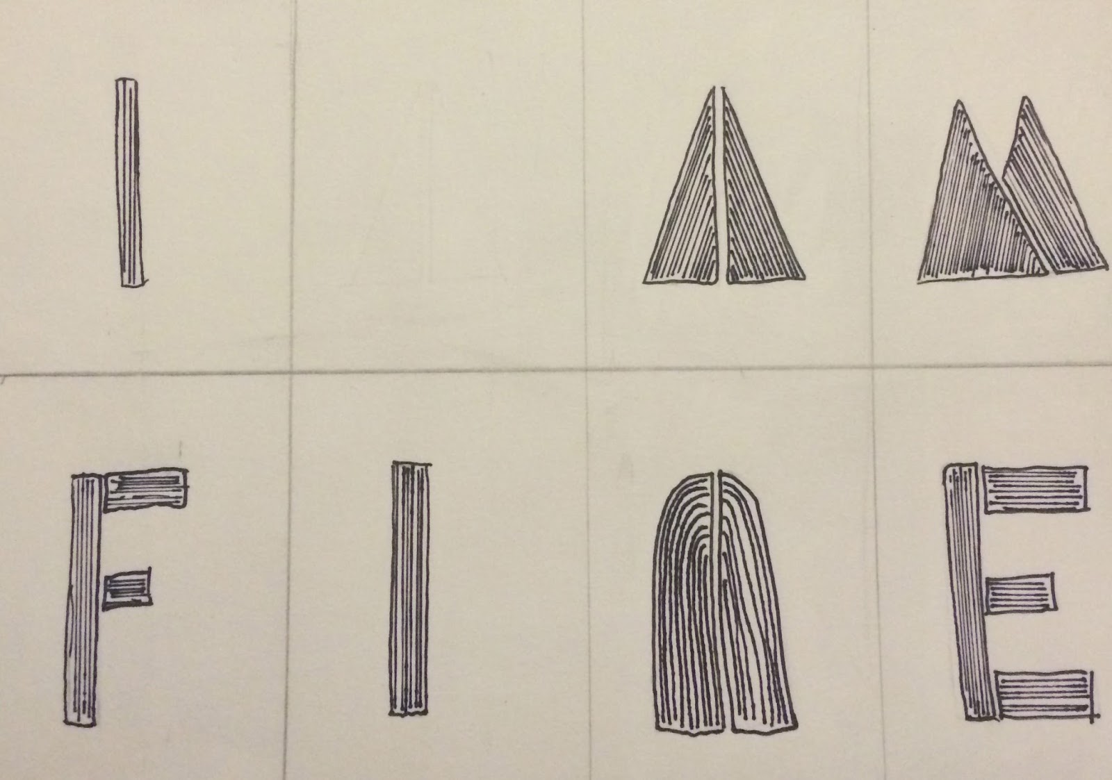

"I AM FINE" 4.

These are my four different experiments using different type styles. I want it to look as simple as possible, because it's quite a delicate subject. However, I really love the last two designs I made. I think they stick to my planned simplicity, yet hold a little more depth, intriguing an audience. 


For inspiration for my last two ideas I looked at the book "Hand Job" by Michael Perry. 

Wednesday, 30 September 2015

Character Design and Development. (2)

The aim of this session is to; Create sketched ideas for a character; create a brand for the character; generate layouts for the package. Eventually this work will include; character sheets and layouts; package nets and artwork; printed prototypes and pack shots.

Things to consider:
- When developing character sheets, you should pay attention to the form of the character, make them dynamic and interesting to look at.
- When considering the brand aspect, you need to make your characters interesting to the consumer.
- What are your characters about?
- What is their story?
- Consider the age group the product will be aimed at.


At first, for my character development, I drew up something quite realistic looking.


My second and third lot of designs are a lot more cartoon like, probably for a different target audience.


This is my sketch of my character. I've drawn the front and back in scale of each other.


After deciding that my character development for Jay's process and production graphic design session will be this bear, I drew up this "three pose" character design sheet, showing the front, back and side portraits of my character.


After designing my bear, I sketched out the net of a cereal box with my character quickly sketched out on the plan. This design is annotated to support my idea.


Character Design and Development. (1)

This session introduced us to production techniques and workflows as they relate to character design. The outcome from our first process and production session will be character sheets and production layouts for a simple character. This character will be developed further in later lessons.

In this session we were expected to; create sketched ideas for a character, create character sheets for this character (poses), generate production layouts for this character (front and side views), consider a colour palette and target for the character.


I started off by drawing simple sketches of different characters, aiming for a dancer/ice-skater/gymnast style character.


I started looking in detail, at body shape, and displaying movement within my drawings.


My final character design, ended up being a gymnast. I want to show strength and movement within my design, although I want her to hold some level of beauty as well. I finished this weeks session off by creating a design sheet portraying a possible frame by frame sketch of a routine a gymnast would show off.


12 basic principles of animation:
1. SQUASH & STRETCH
2. ANTICIPATION
3. STAGING
4. STRAIGHT AHEAD & POSE TO POSE ANIMATION
5. FOLLOW THROUGH & OVERLAPPING ACTION
6. SLOW OUT & SLOW IN
7. ARCS
8. SECONDARY ACTION
9. TIMING
10. EXAGGERATION
11. SOLID DRAWING
12. APPEAL

Wednesday, 29 April 2015

Deconstruction and Culture Jamming.

“The goal of communication is to induce the audience some belief about the past, present or future” – Richard Buchanan – Declaration of design (1985)

“Any advert in public space that gives you no choice whether you see it or not is yours. It’s yours to take, re-arrange and use” – Banksy.

The idea of Culture Jamming is to kind of “bully” advertisements if you like and create alternative meanings to well known adverts.

Here are some great examples of culture Jamming:


Wednesday, 11 March 2015

Change.

Last week, I was asked by a very good friend of mine who is running for the position to Students with Dependents in the SU elections this year, to create a logo for her party in the election. 

I was given some very basic information as to what her party were wanting for their logo such as:
* Purple and Yellow colours.
* "To guarantee the positive changes you've all been waiting for".
* The link to election website.

After having these basic guidelines, I began to just play around with some fonts, and shapes.

At first I just started off with creating the logo with just the name of their party. 


Once we'd agreed on the font and main design to be used for the main part of their logo, I went on to add in the rest of the assets that they wanted in there.

I'm really quite proud of what I have come up with for this considering I was asked to create something in such a short space of time. I'm also proud to say it has just been announced that my friend who asked me to create this design for her, won the position for Students with Dependents in the SU council!

Thursday, 19 February 2015

Adobe Illustrator tutorial. 2


Today we had our second introduction to the software, Adobe illustrator. In this session we created two illustrations; one being a Rocket and the other, a Pear. We were learning new techniques as we went along.

We started our session discussing; "Is it possible to create an illustration with a maximum of six shapes?". Not thinking this was possible, I quickly learnt otherwise!

 These are my notes from this workshop.

Basically This section where we created our Rocket, involved a mixture of techniques; Things like adding two or three different strokes onto shapes creating depth. This is what helped us create our shape with a minimal amount of layers, keeping it simple, yet effective.


This next task, where we created a our illustration of a realistic looking pear was managed by using a tool called the "Gradient Mesh" tool. To start, we drew out our pear using the pen tool, then after selecting the gradient mesh tool, we made our "mesh" bend, and fit to the shape of our pear.
To finalise our illustration we picked out colours from an image of an actual pear to create a realistic look and found and blended in, a pattern on top to give our illustration a bit of texture.

All in all, I found that this workshop wasn't only fun, but really informative, I learnt quite a lot of new techniques and I can say I'm quite proud of the work that I have produced.

Thursday, 12 February 2015

Kinetic typography, After Effects.

At the end of our last After Effects session, we were given a task to find a quote or a lyric that we like and some kind of typography style that catches our eye. I chose the quote by Charles Bukowski:
    "My dear, find what you love and let it kill you."
For the typography style that caught my eye, I downloaded a font from the internet called "MNML FNT" 


The upper case letter for this font, you can see the full character, whereas with the lower case, it's all distorted. I thought this would create a great effect for my kinetic typography if I was to somehow switch between the two.


Kinetic typography Charles bukowski from Emma Perrett on Vimeo.

The music in this video is me playing the guitar, it's a cover of a song called "Boats and Birds" by Gregory and the Hawk, and I thought that the soft, but frequent note changes fit well with the changes in the text.

Next time I make something like this, I think that I might try and make it a little less simplistic and a bit more creative, however I do like the may this piece has turned out.